


click to get service View profile
Learn how to master user-friendly website design with our step-by-step guide. Discover key principles, tools, and strategies to create stunning, intuitive, and responsive websites that deliver exceptional user experiences
In today’s digital-first world, your website serves as the first and most powerful impression of your brand. Mastering User-Friendly Website Design is not just about creating something visually appealing — it’s about delivering an experience that feels intuitive, seamless, and memorable. A truly stunning and user-focused website builds trust, engages visitors, and leaves a lasting impact from the very first click.
For UI/UX designers, the challenge is to blend creativity with functionality, ensuring that users not only stay longer but also enjoy every second of their journey.
Whether you’re designing a personal portfolio, an e-commerce store, or a complex SaaS platform, mastering the principles of effective web design is key to success.
In this guide, we’ll take you step-by-step through the principles of User-Friendly Website Design, showing you how to create visually stunning, highly intuitive websites that not only captivate visitors but also convert them into loyal, long-term users.
Understand Your Audience
Before you even start sketching wireframes or choosing color palettes, the first and most important step is understanding your audience.
A stunning design is useless if it doesn’t solve your users’ needs or fit into their behavior patterns.
Here’s how you can deeply understand your audience:
1. Conduct User Research
- Surveys & Interviews: Talk directly to potential users. What do they expect? What frustrates them?
- Analytics: Check existing website data (if available) to understand user behaviors — bounce rates, time on site, popular pages.
- Competitor Analysis: See what your competitors are doing right (or wrong).
2. Create User Personas
- Build fictional characters based on real user data.
- Include their goals, pain points, tech savviness, demographics (age, gender, profession).
- Example:
- Persona 1: “Busy Professional” — wants quick, no-fuss navigation, prefers minimalistic design.
- Persona 2: “First-time Online Shopper” — needs easy guidance and reassurance.
3. Understand User Goals and Pain Points
- What is your user trying to achieve on your site? (Buying a product, finding information, booking a service?)
- What barriers could frustrate them? (Slow load time, confusing navigation, too many popups?)
Solve real problems — don’t just decorate.
4. Map the Customer Journey
- Plot out the steps a user takes from landing on your site to achieving their goal.
- Identify where they might get stuck or frustrated.
- Smoothen the flow wherever possible.
5. Adapt Design According to User Behavior
- Design layouts and interactions based on how users naturally behave, not how you want them to behave.
- Example: If mobile usage is 80%+, prioritize a mobile-first design.
Craft a Clear and Intuitive User Flow
Designing a visually stunning website is important, but if users can’t navigate easily or find what they need quickly, they’ll leave.
A clear and intuitive user flow is at the heart of effective User-Friendly Website Design, guiding users effortlessly through their journey — like invisible signposts that lead them exactly where they want to go without confusion or friction.
Here’s how you can craft a powerful user flow:
1. Start with the User’s Primary Goal
- What is the main action the user wants to complete?
(e.g., Purchase a product, sign up for a service, book an appointment.) - Your flow should revolve around helping users achieve that goal with minimum confusion.
2. Create a Logical Structure (Sitemap)
- Sketch out a simple sitemap showing major sections and how they connect.
- Keep the structure shallow — avoid making users click through too many layers.
- Example:
- Home → Product Categories → Product Page → Add to Cart → Checkout.
3. Use Progressive Disclosure
- Show only what’s necessary at each step.
- Don’t overwhelm users with too much information at once.
- Example: Instead of showing full product specs immediately, provide a “Read more” option.
4. Maintain Consistency in Navigation
- Menus, buttons, and navigation links should behave consistently across the site.
- Predictability makes users feel comfortable and builds trust.
5. Minimize Cognitive Load
- Fewer choices = faster decisions.
- Group related actions together (e.g., related products shown under a product page).
6. Visual Cues and CTAs (Call-to-Actions)
- Use clear CTAs: “Sign Up”, “Add to Cart”, “Learn More”.
- Highlight next steps using color contrast, arrows, or animated micro-interactions.
- Guide users visually — don’t leave them guessing!
7. Test and Refine the Flow
- Conduct usability tests with real users.
- Observe where users hesitate, get confused, or backtrack.
- Continuously refine paths to remove friction points.
Wireframing and Prototyping
After understanding your users and crafting a clear user flow, the next essential step in mastering User-Friendly Website Design is wireframing and prototyping. Wireframes act as simple, low-fidelity blueprints that define the structure and layout of your website — placing headlines, images, buttons, and key sections without getting distracted by colors, fonts, or visuals. Think of it like the architectural blueprint of a house: it doesn’t show the wall colors or furniture but provides a clear and organized foundation for building a seamless and intuitive user experience.
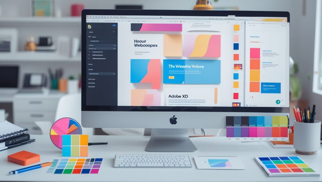
Starting with quick wireframes is a crucial step in achieving effective web design. It helps you identify layout issues early, set clear content priorities, and keep the focus firmly on usability. Whether you use tools like Figma, Balsamiq, Adobe XD, or simply sketch with paper and pencil, wireframing ensures a strong structural foundation. Once your wireframes are in place, the next step is prototyping — creating interactive, clickable models that simulate real user actions, such as navigating menus, clicking buttons, or submitting forms, bringing your website to life before development begins.
Prototyping is a vital step in creating a successful User-Friendly Website Design, allowing you to test the user journey early, gather valuable feedback, and uncover usability issues before any code is written. With tools like Figma’s interactive prototyping features or platforms like InVision, you can quickly build basic prototypes and share them with clients, stakeholders, or test users for real-time input. Always start with wireframing to set a strong structural foundation, then move to prototyping to refine and perfect the user experience. By iterating early and often, you minimize costly revisions later and move closer to delivering a website that’s not just visually stunning but also highly functional and seamless for users.
Visual Design Principles
Once the wireframe and prototype are complete, it’s time to infuse your project with life and character by applying strong visual design principles — a crucial part of crafting an effective User-Friendly Website Design. Visual design goes beyond just making things “look good”; it’s about creating clarity, directing focus, and building emotional connections through thoughtful use of colors, typography, spacing, and imagery. A well-executed visual design guides users intuitively — helping them know where to look, what actions to take next, and ensuring they enjoy every interaction with your site.
One of the most important principles of web design is consistency. Every element on your website — from buttons and fonts to icons and colors — should behave and appear predictably, building trust and minimizing user confusion. Stick to a cohesive color palette that aligns with your brand identity, and use typography strategically to create a clear visual hierarchy — for example, using larger, bolder fonts for headings and smaller, lighter fonts for body text. Consistency not only enhances the aesthetic appeal but also makes navigation effortless for users.
Another key to achieving great User-Friendly Website Design is using visual hierarchy to guide users’ eyes naturally across the page. Highlight important elements, like call-to-action buttons, by using size, color, or strategic placement, while keeping secondary information lighter or smaller. Smart use of white space — the empty areas between elements — is equally powerful. It prevents clutter, gives your design a clean, breathable feel, and draws attention to what truly matters. Don’t hesitate to leave space empty; effective use of white space makes critical content stand out even more.
Alignment and balance are vital components of a successful web design. Ensuring that text boxes, images, and other elements are properly aligned creates a sense of order and professionalism. You can use symmetry or intentional asymmetry to add visual interest without overwhelming the user. Equally important is prioritizing readability: ensure font sizes are large enough, color contrasts are strong, and text is easy to scan, especially on mobile devices, for a seamless experience across all screens.
Finally, your visual style should align with the emotions you want users to feel. In User-Friendly Website Design, warm colors can evoke energy and excitement, while cooler tones promote calmness and trust. Carefully choose imagery, illustrations, and animations that complement your website’s vibe, creating a cohesive and emotionally engaging experience for your users.
By mastering these visual design principles, you’ll not only create visually stunning interfaces but also enhance usability, user engagement, and brand perception. A well-executed design leads to websites that users genuinely enjoy interacting with, fostering long-term loyalty and satisfaction.
Focus on Usability and Accessibility
Focusing on usability and accessibility is crucial for crafting a User-Friendly Website Design that’s not only visually appealing but also functional for all users, regardless of their devices, abilities, or experiences. A website with strong usability provides a seamless, efficient, and enjoyable experience, while accessibility ensures that everyone, including people with disabilities, can interact with your site without barriers.
Usability begins with simplicity. In User-Friendly Website Design, the goal is to make it as easy as possible for users to achieve their objectives with minimal effort. Navigation should be intuitive, ensuring users always know where they are and how to move forward. Clear, consistent menus, recognizable icons, and well-defined buttons all play a key role in creating a seamless and usable site experience.
A clear call-to-action (CTA) is essential in User-Friendly Website Design. Buttons like “Sign Up,” “Add to Cart,” and “Learn More” should be easy to spot and stand out on the page. To further enhance usability, reduce friction in key tasks like forms, checkout processes, or account creation. Implement features like pre-filled options, auto-complete fields, and concise instructions to guide the user and ensure a smooth, frustration-free experience.
On the other hand, accessibility is about making sure your website is usable for people with disabilities, including visual, auditory, motor, or cognitive impairments. Web Content Accessibility Guidelines (WCAG) offer a framework to ensure websites are accessible. Some key principles include:
- Text alternatives: Use alt text for images, so screen readers can describe them to users with visual impairments.
- Color contrast: Make sure your text stands out clearly against the background, especially for users with color blindness.
- Keyboard navigation: Users who can’t use a mouse should still be able to navigate the website easily using just the keyboard.
- Clear language and instructions: Use simple, straightforward language and provide clear instructions for actions like filling out forms or making purchases.
Don’t forget mobile-first design — as more users access websites through their phones, ensuring your site works perfectly across different screen sizes is a must. Make sure interactive elements are large enough to tap on smaller devices and that text remains legible without the need to zoom.
By prioritizing usability and accessibility in your User-Friendly Website Design, you create an experience that works for everyone, boosting engagement and establishing a more inclusive digital presence. It’s not just about meeting legal requirements — it’s about showing your users that you truly care about their experience, regardless of their abilities or devices.
Performance Optimization
Performance optimization is a critical element of User-Friendly Website Design, ensuring that users have a fast, smooth, and enjoyable experience when navigating your site. A slow-loading website not only frustrates visitors but also harms your SEO rankings and conversion rates. To deliver an exceptional user experience, make performance a priority throughout every stage of the design and development process.
1. Page Load Speed
The first and most obvious factor in performance is loading speed. Studies show that 40% of users will leave a site if it takes more than 3 seconds to load, and each additional second of loading time can reduce conversions by up to 7%. In User-Friendly Website Design, optimizing load time is crucial for retaining users, boosting engagement, and ensuring your site performs at its best.
Some key strategies include:
- Image Optimization: Images are often the largest files on a webpage. Use compression tools like TinyPNG or ImageOptim to reduce file sizes without sacrificing quality. Also, consider using modern formats like WebP, which offer better compression.
- Lazy Loading: Implement lazy loading for images and videos so they only load when they are in view, improving initial load time.
- Minify CSS, JavaScript, and HTML: Removing unnecessary spaces, comments, and characters can significantly reduce file sizes, helping pages load faster.
- Use a Content Delivery Network (CDN): Distribute your website’s content across various servers around the world. This way, users can access your site from the server closest to them, speeding up load times.
2. Responsive Design
With mobile traffic surpassing desktop traffic, ensuring your website performs seamlessly across all devices is more important than ever. A responsive design adapts the layout and content based on screen size, providing optimal performance on mobile phones, tablets, and desktops. In User-Friendly Website Design, responsiveness is key to delivering a consistent, high-quality experience no matter how users access your site.
- Fluid Grids and Flexbox: Use relative units like percentages for widths, and flexible layouts with Flexbox or CSS Grid to ensure content adapts well to any screen size.
- Media Queries: Tailor the layout for specific screen sizes, ensuring that images and text remain legible and navigable across devices.
3. Browser Caching
Browser caching is a powerful technique in User-Friendly Website Design that allows websites to store key elements locally on a user’s device — like images, CSS files, and JavaScript. This reduces the need to re-download these files each time the user visits, significantly improving the speed for returning visitors.Set appropriate cache expiration times for static assets like images and stylesheets to maximize this benefit.
4. Reduce HTTP Requests
Every element on a webpage, such as images, stylesheets, and scripts, requires an HTTP request to the server. The more requests your site makes, the slower it will load. Minimize these requests by:
- Combining multiple CSS or JavaScript files into one.
- Using SVG images instead of separate image files where possible.
- Using CSS sprites to combine small images into a single file, reducing the number of image requests.
5. Optimize JavaScript
JavaScript is powerful, but excessive or poorly optimized scripts can slow down your site. Minimize the use of heavy libraries and frameworks when possible.
Additionally, consider:
- Asynchronous loading: Load non-essential JavaScript files asynchronously so they don’t block the rendering of your page.
- Defer loading: Defer JavaScript execution until after the page content is fully loaded to avoid delaying the initial page render.
6. Reduce Server Response Time
Your hosting service plays a significant role in your site’s performance. If the server response time is slow, it can lead to poor performance regardless of how optimized your site is. Some steps to improve server response time:
- Use a fast and reliable web hosting provider with minimal downtime.
- Enable Gzip compression to reduce the size of files sent from the server.
- Consider upgrading to HTTP/2 if your server supports it, as it improves load times by allowing multiple requests to be sent at once.
7. Test and Monitor Performance
Regular testing is key to maintaining a high-performing website. Tools like Google PageSpeed Insights, GTmetrix, and Pingdom provide valuable insights and actionable recommendations for improving your site’s performance. Continuously monitor the performance of your site to ensure that as you add new features, the speed doesn’t suffer.
Testing and Feedback
Testing and Feedback: The Key to Continuous Improvement
Designing a beautiful and functional website is only half the battle. To truly deliver a User-Friendly Website Design, testing and gathering feedback are essential. Testing helps validate assumptions, uncover usability issues, and refine the overall experience before launch. Real user feedback provides valuable insights into how your website performs in the real world, ensuring it meets the needs of your audience.
1. Types of Testing for Web Design
Testing can be broken down into several types, each serving a unique purpose:
a. Usability Testing
- Purpose: To identify user pain points and make sure users can easily navigate your site and complete their goals.
- How to Conduct: Ask real users to perform tasks on your website (e.g., signing up, making a purchase) while observing their actions. Note where they struggle or hesitate. Tools like Lookback or UserTesting are great for conducting remote usability tests.
b. A/B Testing (Split Testing)
- Purpose: To compare two different versions of a webpage (or a specific element) and determine which one performs better in terms of user behavior (e.g., click rates, conversions).
- How to Conduct: Create two variants of a page and show each to different groups of users. Measure metrics like bounce rates, time on page, and conversion rates using tools like Google Optimize or Optimizely.
c. Performance Testing
- Purpose: To ensure your website loads quickly and performs smoothly under various conditions.
- How to Conduct: Use tools like Google PageSpeed Insights, GTmetrix, or Pingdom to test your website’s load time and performance. Test across different devices, browsers, and network conditions to identify potential bottlenecks.
d. Mobile Testing
- Purpose: To make sure your website is responsive and works perfectly on all mobile devices.
- How to Conduct: Test your website on a range of devices (smartphones, tablets) using tools like BrowserStack or Google’s Mobile-Friendly Test to ensure a seamless mobile experience.
2. Gathering and Analyzing Feedback
Feedback is an invaluable resource for improving user experience and enhancing the design process. It’s important to gather both qualitative and quantitative feedback:
a. Qualitative Feedback
- Purpose: Provides insight into the emotional response, thoughts, and experiences of users.
- How to Collect: You can collect qualitative feedback through user interviews, surveys, or direct observation during usability tests. Ask questions like, “What did you like about the design?” or “What could be improved?”
- Tools: Typeform, SurveyMonkey, or even social media polls can help collect feedback directly from users.
b. Quantitative Feedback
- Purpose: Offers data-driven insights, allowing you to measure user behavior and preferences.
- How to Collect: Tools like Google Analytics or Hotjar can track how users are interacting with your website, including click rates, bounce rates, and time spent on pages.
- What to Measure: Key metrics to focus on include conversion rates, page views, form submissions, and bounce rates.
3. Iterating Based on Feedback
After gathering testing data and feedback, it’s time to analyze and iterate. The goal of this step is to:
- Identify common usability issues or pain points.
- Discover opportunities to improve design elements (e.g., color contrast, button placement, or form fields).
- Optimize for better performance and user engagement.
Feedback shouldn’t be a one-time activity; it should be ongoing. As your website evolves, so should your testing and feedback process. Implementing small changes over time allows you to continuously improve the site, making it more intuitive and user-friendly.
4. Tools for Testing and Feedback
Here are some tools you can use for effective testing and gathering feedback:
- Usability Testing: UserTesting, Lookback, Maze.
- A/B Testing: Google Optimize, Optimizely, VWO.
- Performance Testing: Google PageSpeed Insights, GTmetrix, Pingdom.
- Mobile Testing: BrowserStack, Google Mobile-Friendly Test.
- Feedback and Surveys: Typeform, SurveyMonkey, Hotjar, Usabilla.
5. The Importance of Continuous Testing
Remember, testing and feedback shouldn’t stop once your website goes live. In User-Friendly Website Design, continuous monitoring, testing, and optimization are essential to keeping your website relevant and effective in meeting user needs. Regular iteration helps you stay aligned with evolving user expectations, new technologies, and changing business goals, ensuring your site remains top-notch.
By consistently testing and integrating user feedback, you ensure that your website not only performs well at launch but continues to provide value to users, resulting in a better user experience and higher conversion rates over time.
Launch and Continuous Improvement
Launch and Continuous Improvement: Perfecting the User Experience Over Time
The launch of your website is a major milestone, but it’s just the beginning of your journey as a UI/UX designer. After all the design work, testing, and feedback, you’re ready to release your website to the public. However, a successful launch is only the start. The real work lies in ensuring continuous performance and user experience improvements. In User-Friendly Website Design, ongoing optimization is key to keeping your site relevant, functional, and user-centered.
1. Preparing for a Smooth Launch
Before launching your website, it’s crucial to ensure everything is ready for a seamless rollout. Here’s a checklist to ensure a smooth launch:
- Final Testing: Double-check everything, from responsive design to load times and form submissions. Make sure all links work, all images load correctly, and that there are no broken elements.
- SEO Optimization: Ensure that your website is optimized for search engines with proper meta tags, alt text for images, and a clean URL structure. Tools like Yoast SEO (for WordPress) or Google Search Console can help track your SEO performance.
- Analytics Setup: Install tracking tools like Google Analytics or Hotjar to monitor user behavior and gather insights once the site is live. Set up goals to track conversions, form submissions, or any other important actions.
- Security Check: Ensure that your website is secure by installing an SSL certificate and checking for vulnerabilities. Website security is vital for both trust and search engine rankings.
- Backup Plan: Make sure your website is backed up regularly to avoid losing data in case of an issue. Use reliable hosting providers and implement automated backups.
2. Post-Launch Monitoring and Maintenance
Once your website is live, the real work begins. Monitoring performance and keeping your website updated is a continuous process. Here’s how you can maintain the site post-launch:
- Monitor User Behavior: Use tools like Google Analytics and Hotjar to track how users are interacting with your site. Look at key metrics like bounce rate, time on page, and user flow to understand how visitors navigate your site.
- Performance Monitoring: Keep an eye on site speed, uptime, and loading times. Use tools like Pingdom, GTmetrix, and Google PageSpeed Insights to regularly test the performance and resolve any slow-loading pages or broken links.
- Bug Fixes and Updates: Websites are dynamic, and bugs or issues can crop up anytime. Keep your software up to date, fix any bugs reported by users, and update content regularly to ensure everything runs smoothly.
- Mobile Optimization: As new devices and screen sizes are released, ensure your website remains fully optimized for mobile users. Regularly test on new devices and browsers to keep your site responsive.
3. Continuous Improvement Through User Feedback
The feedback loop doesn’t end at the launch stage. User feedback is invaluable for identifying issues that weren’t caught during the design and testing phase. Collecting feedback continuously helps you stay on top of user needs and makes sure your website remains user-centered.
- Surveys and Polls: Use tools like SurveyMonkey or Typeform to collect feedback from your users after they’ve interacted with your site. Ask questions that help you understand pain points, areas of improvement, and what users like most about your site.
- Usability Testing: Conduct periodic usability testing with real users to identify areas that need improvement. Testing should be an ongoing process to catch any issues that may arise as users interact with new content or features.
- User Reviews and Social Media: Keep an eye on user reviews, comments, and feedback on social media. This is a goldmine for identifying recurring issues or suggestions that can be implemented in future updates.
4. Iterating and Evolving Your Design
User needs, business goals, and web technologies evolve over time, and your website should evolve with them. Iterative design is the process of continually improving your website based on feedback, analytics, and new trends. This allows you to stay competitive and meet the ever-changing needs of your audience.
- Small, Incremental Changes: Instead of waiting for a major redesign, implement small changes regularly based on user feedback. For instance, update a button color to make it more visible, improve a form field layout for better usability, or add new content that addresses user queries.
- A/B Testing for Improvements: Run A/B tests to compare how new features or designs perform against existing elements. Whether it’s a new CTA button or a different layout, testing can help ensure that changes will improve conversions or engagement.
- Keeping Up with Trends: Design trends, technology, and user preferences change quickly. Keep an eye on the latest developments in UI/UX design and web development to keep your website fresh and up to date.
5. SEO and Content Updates
A website isn’t just about design and user experience — it’s also about delivering valuable content to your audience. Search engine optimization (SEO) is a continuous process that ensures your site ranks well in search engines, driving organic traffic and improving visibility.
- Regular Content Updates: Keep your content fresh by adding new blog posts, updating outdated information, and ensuring that all your content is relevant and engaging for users.
- SEO Audits: Conduct regular SEO audits to check for broken links, outdated keywords, or any SEO issues that could affect your rankings. Tools like SEMrush, Moz, or Ahrefs can help identify areas for improvement.
6. Staying Agile and Responsive
The digital landscape is constantly evolving, so staying agile is crucial in User-Friendly Website Design. Stay responsive to technological advances, user feedback, and emerging trends. Build flexibility into your design to adapt quickly, making adjustments without needing to overhaul the entire site.
Treating the website launch as just the start of an ongoing process of monitoring, iterating, and improving ensures that your site remains relevant, user-friendly, and effective in meeting your users’ needs. Continuous improvement isn’t a one-time task; it’s a mindset that helps you stay competitive, adapt to change, and provide an exceptional User-Friendly Website Design that evolves with your users over time.
Conclusion
Designing a stunning, user-friendly website is all about striking the perfect balance between creativity and functionality. By prioritizing user needs, optimizing performance, and continuously iterating based on feedback, you can create an engaging experience that keeps users returning. Remember, a successful website isn’t a one-off project; it’s an ongoing journey of improvement and refinement. Keep testing, learning, and evolving to ensure your User-Friendly Website Design always meets the highest standards.