


click to get service View profile
Discover the essentials of Responsive UI Design and learn how to craft user interfaces that adapt seamlessly to every screen size. Explore mobile-first strategies, key best practices, and the top tools for creating a flawless cross-device user experience.
In today’s multi-device world, users expect seamless digital experiences—whether they’re browsing on a massive desktop monitor, a mid-sized tablet, or a compact mobile screen. This makes responsive UI design not just a nice-to-have, but an absolute necessity for any product, website, or app.
But creating interfaces that actually work well across all devices isn’t just about resizing elements. It’s about understanding user behavior, device breakpoints, layout flexibility, and performance optimization. Whether you’re a beginner or a seasoned designer looking to sharpen your skills, mastering responsive UI design can significantly elevate your design game and user satisfaction.
In this guide, we’ll break down the core principles, best practices, and practical tips for designing responsive interfaces that are intuitive, beautiful, and functional—on every screen.
Step 1: Understanding Responsive UI Design Basics
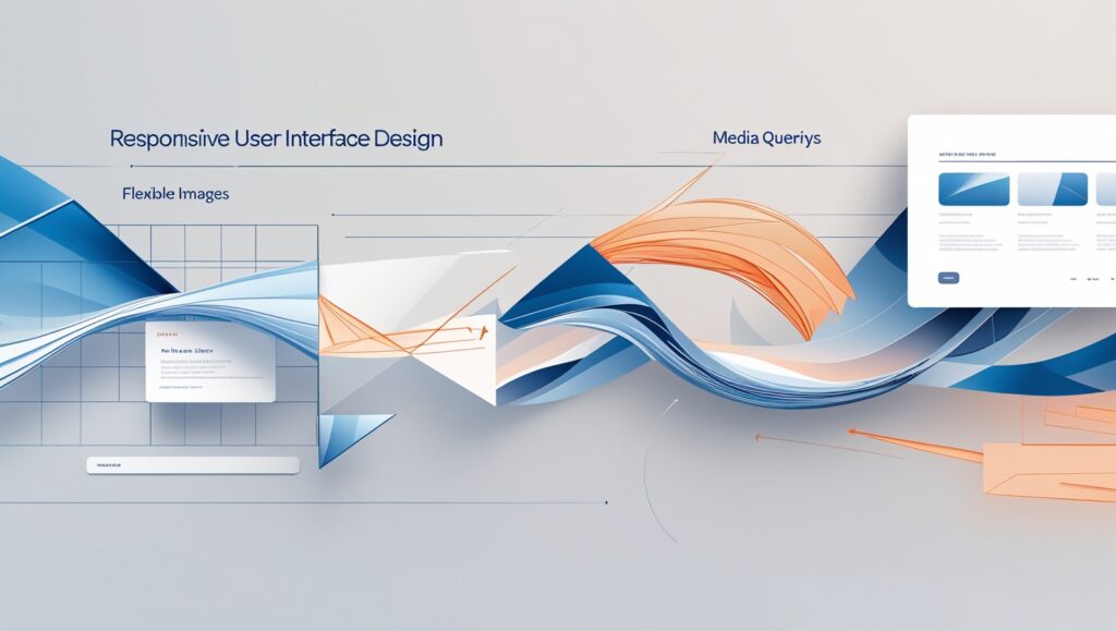
Before diving into tools or writing code, it’s essential to understand the core principles of responsive UI design. At its heart, responsive design ensures that your interface adapts seamlessly to different screen sizes, resolutions, and orientations. This starts with mastering three key concepts: fluid grids, which use percentage-based widths to create flexible layouts; flexible images, which scale within their containers to prevent overflow; and media queries, which apply specific styles based on device characteristics like width, orientation, or resolution. These foundational elements allow you to build designs that not only look good but also function consistently across devices. Pro tip: Use browser developer tools early in your process to preview and fine-tune responsiveness before moving to development. Understanding these basics sets the stage for creating truly adaptive and user-friendly digital experiences.
Step 2: Setting Up Your Responsive UI Design Environment
A well-organized workspace is essential for designing responsive UIs efficiently and consistently. The first step is choosing the right tools. For design and prototyping, platforms like Figma, Adobe XD, and Sketch allow you to create adaptive layouts with constraints and flexible components. On the development side, editors like VS Code or Sublime Text offer powerful features and extensions that support responsive coding.
To speed up implementation, consider integrating responsive frameworks such as Bootstrap, Foundation, or Tailwind CSS. These come with built-in grids and components designed to adapt to various screen sizes, reducing repetitive coding tasks.
It’s also important to test your designs in real-time. Tools like Window Resizer or Responsive Design Checker help you quickly preview how your layout performs across breakpoints without switching devices. Chrome DevTools’ built-in device emulators are especially useful during the early testing phase.
Lastly, invest time in building a responsive style guide. Define rules for typography, colors, spacing, and components that scale across devices. A solid style guide ensures consistency, saves time, and makes collaboration smoother with developers or other designers.
By setting up the right environment from the beginning, you lay the groundwork for faster, cleaner, and more scalable responsive UI design.

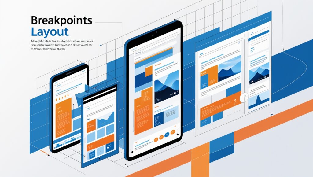
Step 3: Designing for Multiple Breakpoints
Breakpoints are a fundamental part of responsive UI design—they determine the screen widths at which your layout should adapt to provide the best user experience. Typical breakpoints include 320px for mobile, 768px for tablets, and 1024px or higher for desktops. However, instead of sticking to fixed values, let your content dictate when the layout needs to change. Designing with a mobile-first approach ensures your core experience works well on small screens before scaling up to larger viewports. Use modern tools like Figma’s auto layout and constraints or CSS Flexbox and Grid to create responsive structures that shift smoothly across breakpoints. Regularly test your layout on real devices and simulators to catch issues early and ensure a seamless experience across all screen sizes.
Step 4: Optimizing Images and Media for Responsiveness
Images and media are powerful elements in responsive UI design—but if not optimized, they can severely impact performance and user experience, especially on mobile networks. Large file sizes lead to slower load times, increased bounce rates, and frustrated users. To avoid this, use modern image formats like WebP or AVIF, which offer superior compression with minimal quality loss compared to JPEG or PNG. Implement the HTML srcset and sizes attributes to serve appropriately sized images based on the user’s screen resolution and viewport, reducing unnecessary bandwidth usage. Always set max-width: 100% in CSS to ensure images scale within their containers and don’t overflow or distort your layout. For video content, opt for responsive embeds using aspect-ratio containers and consider lazy loading so media loads only when it’s needed. Use optimization tools like TinyPNG, Squoosh, or ImageOptim to compress assets before upload. Pro tip: Consider a content delivery network (CDN) to serve media files faster worldwide. Prioritizing lightweight, flexible media ensures your UI looks sharp and loads fast on every device, making your design both visually appealing and performance-driven.

Step 5: Testing and Debugging Your Responsive Design
Even the most well-planned responsive UI design requires rigorous testing to ensure it performs reliably across all devices and scenarios. While emulators like Chrome DevTools, BrowserStack, or Responsively App are great for quick previews, nothing beats testing on real physical devices to catch subtle usability issues. Look for common problems such as misaligned grids, clipped or overflowing text, broken media queries, or inconsistent spacing between breakpoints. Touch targets are especially critical—on mobile, buttons and interactive elements should have enough padding (at least 48x48px) to be tapped comfortably. Don’t overlook accessibility: check keyboard navigation, screen reader compatibility, and sufficient contrast across all screen sizes. Pro tip: simulate varied network conditions like 3G or offline mode to evaluate how your layout handles slow or unstable connections. Use performance auditing tools like Google Lighthouse to detect slow-loading assets, layout shifts, or accessibility barriers. Testing isn’t a one-time step—it should be integrated throughout your design and development process to ensure a truly responsive and user-friendly interface.

Step 6: Implementing Accessibility in Responsive UI Design
A truly responsive UI design isn’t just about layout—it must also be accessible to all users, including those with disabilities. A responsive design that looks great but isn’t usable by people relying on assistive technologies misses the mark. Begin by aligning with WCAG (Web Content Accessibility Guidelines) standards, which include using proper color contrast ratios, scalable and legible typography, and keyboard-friendly navigation for users who can’t use a mouse. Ensure your UI adapts not only to different screen sizes but also to different input methods, like screen readers and voice navigation. Use semantic HTML elements (like <nav>, <main>, <header>) to provide meaningful structure, making it easier for assistive tech to parse the content. Implement ARIA (Accessible Rich Internet Applications) attributes only when native elements aren’t enough, and test form elements, modals, and dynamic content for full compatibility.

Step 7: Staying Updated with Responsive UI Design Trends
Responsive UI Design doesn’t stand still—new trends and techniques are constantly emerging. Features like dark mode, variable fonts, and CSS Container Queries are becoming standard tools for creating adaptive, high-performance interfaces. These advancements let designers build more flexible components and enhance user experience across devices. To keep up, follow thought leaders, read design blogs, and join communities on platforms like Figma, Twitter, or LinkedIn. Also, explore tools like CodePen and Web.dev for real-world examples. Pro tip: schedule routine design audits to remove outdated patterns and experiment with modern practices that keep your UI fresh, functional, and future-ready.

Final Thoughts
Responsive UI design is no longer optional—it’s a fundamental part of delivering modern, user-friendly digital experiences. As users interact with websites and applications across a growing number of devices, designing with flexibility, scalability, and accessibility in mind becomes essential.
By mastering core principles like fluid grids, media queries, and breakpoints—and combining them with real-world testing and accessibility best practices—you can ensure your interfaces work beautifully on any screen size. Responsive design isn’t just about adapting to devices, but about adapting to users and their needs.
Keep learning, keep testing, and always design with the user experience in mind. A thoughtful, responsive interface doesn’t just look good—it performs well, feels intuitive, and builds trust with every interaction.