click to get service View profile
Why do websites display correctly on all screen sizes, even though digital products are made in countless sizes like iPhones, Samsungs, and MacBooks?
Is it because companies assign dedicated teams of designers and developers to create interfaces for each screen size individually?
The answer is, of course, no. Today, there are many techniques to ensure websites display properly across various devices. Among them, the most common is Responsive Web Design (RWD). This approach allows a single codebase to adapt to all screen sizes.
So, what exactly is Responsive Web Design?
Why is it so widely adopted?
And how can you design a responsive website?
What is Responsive Web Design?
Responsive Web Design (RWD) is a design approach that ensures websites display correctly and provide optimal usability and user satisfaction across a wide range of devices and screen sizes, including smartphones, laptops, and desktops.
This method was proposed in May 2010 by Ethan Marcotte, against a backdrop of rapidly increasing web users on mobile devices. At that time, WAP design (Wireless Application Protocol) was the common method for mobile design, but it had many limitations. Designers had to create separate versions for each device, which became impractical due to the diversity of screen sizes and device specifications.
In contrast, responsive websites use a single codebase and a single domain to provide the best user experience across all devices. This innovation effectively solved the challenges of WAP design.
Importance of Responsive Web Design
Cost Reduction
Responsive Web Design brings significant financial benefits to businesses.
Since it can adapt to various screen sizes, there’s no need to develop multiple versions of a website. This reduces development costs and also saves time and budget on maintenance and operations for each product.
Improved SEO Rankings
Responsive Web Design uses a single domain and code set across all devices, allowing Googlebot to crawl and index the site more efficiently. This creates a more SEO-friendly website and helps increase organic traffic.
In 2018, Google officially recognized mobile responsiveness as a major factor affecting SEO rankings in Google Search.
Optimized User Experience (UX)
Responsive Web Design significantly improves the user experience, especially on mobile devices. Users no longer need to zoom in excessively to read content. Buttons and links automatically adjust in size and spacing, ensuring smooth interactions.
Moreover, responsive design enhances website loading speed. Since it uses a single URL and serves the same HTML and CSS code to all devices, it eliminates the need for redirects or split URLs. This reduces the amount of data transferred, resulting in faster load times and lower bounce rates.
Difference Between Responsive Design and Adaptive Design

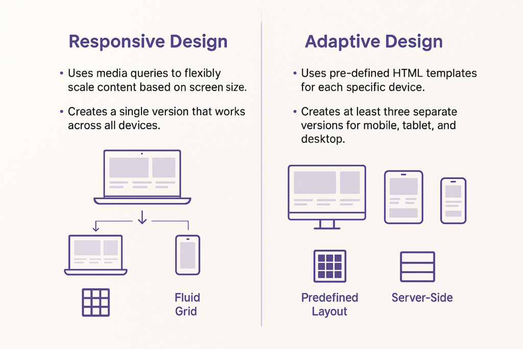
While responsive design enables a single website to adapt to all devices, adaptive design involves creating multiple fixed layouts optimized for different screen sizes.
Responsive Web Design is well-suited for websites with relatively simple structures. Using grid systems available in frameworks like Bootstrap, it allows a single layout to support all devices.
However, for more complex websites, responsive design can cause issues during the scaling process on various devices. That’s why many companies choose adaptive websites to ensure a seamless user experience across all screen sizes.
When designing an adaptive website, designers typically create three separate layouts: one for mobile, one for tablet, and one for desktop.
When a user accesses the site, the system automatically detects the device’s screen size and displays the most suitable layout accordingly.
According to research, adaptive websites can load 2 to 3 times faster than responsive designs.
However, since each screen size requires individual optimization, adaptive design demands more resources and time.
That said, from a cost-efficiency perspective, responsive design remains an attractive option for many companies.
How to Create a Responsive Website That Optimizes User Experience
Start with Wireframes
Wireframes are simple sketches of a website or app interface in a box-holder format. They represent the placement of key components such as buttons, text, and images.
When creating wireframes, it’s important to keep the design very simple. At this stage, the focus is on testing different layout ideas and finding the one that best suits the target users. There’s no need to spend time perfecting every pixel. Instead, the focus should be on functionality and information structure.
Identify Breakpoints
Breakpoints are the screen-width thresholds at which a website adjusts its layout to match the user’s device. These are defined using CSS media queries.
Media queries are a feature of CSS that apply responsive CSS rules based on specific conditions like device type or display environment. Within a media query, breakpoints are defined to control when specific CSS rules should be applied.
Developers usually refer to the responsive designer’s wireframes to determine appropriate breakpoints for a project. There is no single standard for selecting breakpoint values—they vary depending on each website’s specific design and content.
However, here are three commonly used breakpoint ranges:
- 320–768px: for smartphones
- 768–1024px: for tablets
- 1024px and above: for laptops, desktops, and TVs
Prioritize Mobile-First Design
When designing a responsive UI, it’s best to start with the mobile version first, and then scale up to adjust content for larger screens. This approach is known as “mobile-first” design.
The reason is that mobile-first design forces you to focus on the content and features that truly matter to users, avoiding the temptation to add unnecessary elements.
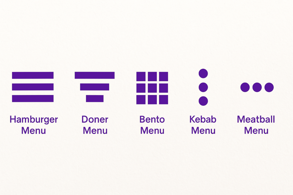
When building a mobile-responsive website, you should also consider hiding some content due to limited screen space. A common example of this is using a “hamburger menu” for navigation.

Additionally, interactive elements should be designed to support touchscreen usability on mobile devices.
Using CSS media queries, you can detect the orientation (screen direction) and aspect ratio of the user’s device, and adjust the design accordingly.
Use of Fluid Grids

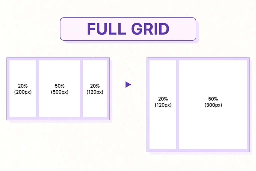
Fluid grids divide the page width into small, evenly sized columns, creating a flexible grid system for displaying content.
A fluid grid defines the maximum layout width of the interface, then divides it into a specific number of columns, assigning each column a corresponding width and height. This allows elements to easily adjust as screen sizes change.
Today, website layout sizes generally fall into two categories:
- Fixed Layout: Designed with standard widths (such as 960px or 1024px). The interface can become unbalanced or feel cramped on different screen sizes.
- Fluid Layout: Uses percentages (%) for widths, allowing the layout to adjust automatically and maintain a consistent, responsive visual design.
Improving Image Sizes
Image quality is a crucial factor in the user experience (UX). Sharp, appropriately sized images leave a good impression on visitors. However, when the device screen size changes, some images may become blurry or distorted, resulting in a less-than-ideal experience.
To improve this, image resizing techniques should be applied. Here are some methods:
- Using CSS
widthandmax-width:
Thewidthproperty sets a fixed image width across all screen sizes. By combiningwidthwithmax-width, you can limit the maximum width while preserving the original aspect ratio. This ensures that even if the image scales, the width-to-height ratio remains intact, preventing distortion. - Using SVG Files:
Unlike raster images (typically JPEG or PNG with fixed resolutions), Scalable Vector Graphics (SVG) have infinite resolution. SVG images are defined using mathematical vectors, allowing them to scale up or down without losing quality. As such, SVGs are highly effective in responsive UX design and can seamlessly adapt to various screen sizes.
Optimizing Typography
Just like images, text quality greatly impacts how visitors perceive a website. Poor typography can harm readability and even lead users to question the credibility of your content or brand.
To optimize your website’s typography, pay attention to the following:
- Choose Appropriate Fonts:
When selecting fonts for websites, prioritize widely supported and readable options such as Helvetica, Roboto, or other common system fonts. These fonts are optimized for clarity across various screen sizes and resolutions. Avoid using decorative or lesser-known fonts that may not render consistently on all devices. - Set Font Sizes Using Fluid Units:
Instead of using fixed pixel values (px), use relative units likeemorrem. This allows the text to scale dynamically based on the user’s screen size, providing a more user-friendly experience across devices.
Here’s an example of setting font sizes using rem units:
html { font-size: 100%; }
@media (min-width: 768px) {
body { font-size: 1rem; }
}
@media (min-width: 1024px) {
body { font-size: 1.5rem; }
}
Conclusion
Creating an effective Responsive Web Design is no longer optional—it’s essential. With users accessing websites from a wide range of devices and screen sizes, delivering a seamless and consistent experience is key to retaining engagement and trust. By starting with simple wireframes, identifying breakpoints, using fluid grids, optimizing images and typography, and adopting a mobile-first approach, designers and developers can build websites that are not only visually appealing but also functionally robust across all platforms. Ultimately, responsive design isn’t just about adaptability—it’s about putting the user first.

