


click to get service View profile
Learn how to create an Effective Dashboard UI that simplifies complex data, enhances user experience, and drives better decision-making with key design principles and best practices.
Designing a dashboard UI goes far beyond aesthetics—it’s about transforming complex data into a clear, actionable, and user-friendly experience. An Effective Dashboard UI enables users to quickly interpret key insights, make informed decisions, and navigate with ease. In this article, we’ll dive into essential principles and best practices for creating an Effective Dashboard UI that not only meets user needs but also elevates overall usability and product performance.
What is Dashboard Design?
Dashboard design refers to the process of creating a visual interface that presents key data, metrics, and insights in an organized and easily digestible format.
With the explosion of data in today’s digital world, making sense of information can be overwhelming. An Effective Dashboard UI solves this by filtering the most relevant data and presenting it through clear, visual elements. By turning complexity into clarity, dashboards enable users to track performance, spot trends, and make confident, data-driven decisions with ease.
3 Common Types of Dashboard Designs
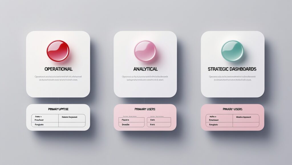
1. Operational Dashboards
Operational dashboards deliver real-time data to keep a close eye on ongoing activities and maintain seamless day-to-day operations. An Effective Dashboard UI ensures these updates are presented clearly and instantly, giving teams a live view of key metrics—allowing them to detect issues early, respond quickly, and stay in control.
Key Characteristics:
- Delivers instant updates on key business metrics.
- Designed for short-term performance tracking and quick decision-making.
- Commonly used by team leads, supervisors, and frontline managers
Key metrics to track: Real-time website traffic (active users, session duration), Customer support performance (ticket volume, response time), Inventory & Order fulfillment (stock levels, shipment status).
2. Analytical Dashboards
Analytical dashboards are designed to explore historical data, uncover patterns, and reveal trends that support long-term strategic decisions. An Effective Dashboard UI transforms complex datasets into clear, insightful visuals—empowering businesses to analyze performance deeply and make data-driven improvements that fuel growth.
Key Characteristics:
- Emphasizes trend analysis and data visualization.
- Helps organizations assess past performance and forecast future outcomes.
- Primarily used by data analysts, BI teams.
Key metrics to track: Sales trends (monthly revenue, conversion rates), Customer retention & churn (repeat purchase rate, churn percentage), and Marketing performance (ROI, cost per acquisition).
3. Strategic Dashboards
Strategic dashboards offer a high-level snapshot of overall business performance, emphasizing Key Performance Indicators (KPIs) aligned with long-term objectives. Built for C-level executives, department heads, and senior managers, an Effective Dashboard UI presents these insights with clarity and precision—enabling smarter strategic planning and informed leadership decisions.
Key Characteristics:
- Focuses on overall business growth and strategic objectives.
- Updated periodically, often on a monthly or quarterly basis.
Key metrics to track: Company-wide KPIs (revenue growth, market share), operational efficiency (cost reduction, productivity rate), employee engagement (retention, satisfaction score).
Key Considerations & Actionable Tips for Designing a Great UI Dashboard
1. Understand Users’ Need
A UI design dashboard is only effective when it serves its users’ needs. To design a truly user-centric dashboard, it’s essential to understand who the users are, what their goals are, and how they will interact with the dashboard daily.
Different user roles have unique needs when it comes to data—executives may prefer quick access to high-level KPIs, while analysts need in-depth data exploration. An Effective Dashboard UI adapts to these varying requirements by offering the right level of detail and functionality for each user. By identifying pain points like information overload or missing insights, designers can create dashboards that deliver truly actionable, meaningful data—not just a flood of numbers.
Actionable Tips:
- Conduct User Research: Gather insights through surveys, interviews, and usability testing to identify pain points and expectations.
- Define User Personas: Map out roles, goals, and data needs to tailor dashboard experiences effectively.
- Enable Role-Based Customization: Show relevant data per user role, reducing complexity and improving efficiency.
2. Establish a Clear Visual Hierarchy
A well-structured dashboard guides users’ attention to the most critical information right away. Without a clear visual hierarchy, users can easily get lost, missing key insights and wasting valuable time. An Effective Dashboard UI leverages size, color, contrast, and spacing to create a natural visual flow—improving readability, focus, and overall decision-making. By highlighting essential data and reducing visual noise, designers can deliver a clean, intuitive user experience.
Actionable Tips:
- Use the Inverted Pyramid Structure: Place the most important data at the top, followed by supporting details, and less critical information at the bottom.
- Prioritize Key Metrics: Highlight crucial KPIs by making them larger, bolder, or using distinct colors to draw immediate attention.
- Follow a Logical Layout: Arrange content in a left-to-right, top-to-bottom flow to match natural reading patterns.
- Reduce Visual Clutter: Remove unnecessary elements, use whitespace strategically, and ensure that every component has a clear purpose.
3. Select the Right Data Visualization Techniques
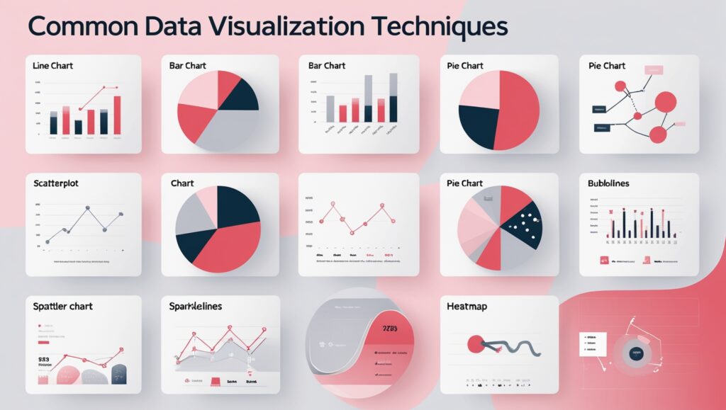
When designing a dashboard UI, selecting the right data visualization method is essential for clarity and effective communication. Each chart type serves a unique purpose, and using the wrong one can lead to confusion or misinterpretation. An Effective Dashboard UI simplifies complex information, highlights key trends, and makes comparisons intuitive—helping users grasp insights quickly and make smarter decisions with confidence.
Some commonly used data visualization techniques include:
- Line Charts: Show trends and changes over time, making them ideal for tracking growth, declines, or fluctuations.
- Bar Charts: Compare values across different categories, helping users easily analyze differences and rankings.
- Pie Charts: Represent proportions within a whole, useful for visualizing percentage breakdowns of a dataset.
- Scatterplots: Display relationships between two variables, helping identify correlations, trends, and outliers.
- Bubble Charts: Extend scatterplots by adding a third dimension, where bubble size represents an additional data point.
- Sparklines: Provide compact, inline visualizations of trends, often used in dashboards or reports for quick insights.
- Heatmaps: Use color gradients to highlight patterns, intensities, or variations in large datasets, making trends easier to spot.
4. Provide Context for Data
Data without context can be confusing or even misleading—numbers and charts alone rarely tell the full story. An Effective Dashboard UI goes beyond raw data by offering meaningful context through explanations, comparisons, and trends. This added layer of insight helps users understand not just what the data shows, but why it matters and how it aligns with broader business goals. Providing context turns information into action and drives smarter decision-making.
For instance, if a sales dashboard shows $100,000 in monthly revenue, is that good or bad? Without context—like past performance, target goals, or industry benchmarks—users may find it hard to interpret the data accurately. An Effective Dashboard UI provides clarity by including contextual elements such as labels, tooltips, trend indicators, and benchmarks. These additions reduce confusion, guide interpretation, and support smarter, data-driven decisions.
Actionable Tips:
- Use Descriptive Labels: Clearly define metrics and data points to eliminate ambiguity. Avoid jargon that may confuse users.
- Add Tooltips & Annotations: Provide on-hover explanations or notes to clarify complex data without overcrowding the interface.
- Provide Trend Indicators: Use arrows, color coding, or sparklines to highlight changes over time for better insight.
- Incorporate Benchmarks & Comparisons: Show how current data compares to past performance, industry standards, or predefined targets to give users a point of reference.
5. Use Color Wisely
Color plays a crucial role in modern dashboard design—it not only enhances visual appeal but also directs attention, improves clarity, and communicates meaning. When applied thoughtfully, color in an Effective Dashboard UI helps users interpret data at a glance and navigate the interface with ease. On the flip side, poor color choices can lead to confusion, misinterpretation, and accessibility issues, ultimately weakening the user experience.
Understanding color psychology, contrast, and hierarchy ensures a seamless user experience where information is clear and easy to digest.
Actionable Tips:
- Use Color to Indicate Status: Apply green for success or positive outcomes, yellow for warnings or pending actions, and red for critical issues or errors. This helps users quickly assess urgency without reading detailed text.
- Ensure Sufficient Contrast: Use high-contrast color combinations (e.g., black text on white background) to improve readability and accessibility. Avoid placing similar colors next to each other to prevent confusion.
- Limit Color Palette: Stick to 3–5 core colors for a clean, professional look. Use shades and tints of the same color to differentiate elements without overwhelming the design.
6. Maintain Design Consistency
Consistency is key to a smooth user experience in dashboard design. An Effective Dashboard UI maintains uniformity across layout, colors, typography, and icons—making interactions predictable and intuitive. When design elements are consistent, users can navigate confidently without wasting time relearning the interface. In contrast, inconsistent visuals create confusion and frustration. A standardized design approach not only boosts usability but also enables quicker, more accurate data interpretation.
Actionable Tips:
- Standardize Fonts & Colors: Use a consistent typography scale, color palette, and icon style to create a cohesive visual identity.
- Maintain Layout Consistency: Keep spacing, alignment, and navigation uniform across all pages. Elements like buttons, filters, and search bars should appear in the same location throughout the dashboard to minimize confusion.
- Define Reusable Components: Build modular UI elements (buttons, cards, charts) that maintain the same structure across different sections.
7. Ensure easy customization
A flexible dashboard is designed to adapt to various user roles, preferences, and tasks—offering a personalized experience for everyone. An Effective Dashboard UI supports customization by allowing users to highlight relevant metrics, rearrange components, and switch between different data visualization styles. This level of flexibility enhances usability, ensuring that each user can interact with the dashboard in a way that best suits their workflow and goals.
Without flexibility, users may find themselves overwhelmed by irrelevant information, which can hinder efficiency and lower engagement. An Effective Dashboard UI offers intuitive customization options, ensuring the interface stays relevant and functional across various workflows, user roles, and experience levels. This adaptability helps users stay focused, productive, and connected to the insights that matter most.
Actionable Tips:
- Drag-and-Drop Layouts: Allow users to rearrange dashboard elements with simple drag-and-drop interactions.
- Personalized Views: Enable users to save custom configurations so they can quickly return to their preferred layout.
- Smart Filtering & Segmentation: Provide dynamic filtering options to help users focus on relevant datasets.
- Adaptive Themes: Offer light and dark mode options to improve readability and comfort.
- Default & Advanced Modes: Maintain preset layouts for beginners while offering advanced users the ability to modify settings, add widgets, or create custom dashboards.
Final thoughts
Need expert guidance on designing an intuitive dashboard that unlocks the full potential of your data? Our UI/UX design specialists are here to help. As a leading UI/UX design company, we go beyond just visual appeal—we focus on in-depth UX research to understand real user needs and apply proven design principles. We craft Effective Dashboard UI solutions tailored to your business goals, ensuring functionality, clarity, and a seamless user experience that drives results.
Contact us today for a FREE consultation and discover how to create the best dashboard design version tailored to your business needs!
Frequently Asked Questions (FAQs)
1. Why do businesses need a good dashboard design?
A well-designed dashboard is essential for modern businesses, offering a clear, intuitive, and data-driven view of key metrics that supports smarter decision-making. An Effective Dashboard UI simplifies complex data into a visually digestible format, saving time on manual analysis and improving operational efficiency. It also fosters better collaboration by delivering real-time insights that keep all stakeholders aligned. With a user-friendly and accessible design, users can effortlessly explore data, spot trends, and take timely action—ultimately driving stronger business outcomes.
2. What are the desirable qualities of an enterprise dashboard?
An enterprise dashboard design should be intuitive, scalable, and data-driven, delivering real-time insights for quick decision-making. It must have clear data visualization for easy understanding, customization options for different user needs, and seamless integration with business tools like CRM and ERP. Strong security ensures data protection with role-based access, while optimized performance allows smooth handling of large datasets without delays.
3. What is the difference between an app dashboard design and a website dashboard design?
An app dashboard design is optimized for mobile and tablet interfaces, prioritizing a compact layout, touch-friendly elements, and efficient navigation due to limited screen space. It often includes simplified visuals, collapsible menus, and gesture-based interactions to enhance usability on smaller screens. In contrast, a website dashboard design is built for larger screens, allowing for more complex data visualization, multi-column layouts, and detailed interactions like hover effects and drag-and-drop functionality. Websites also leverage keyboard shortcuts and extensive tooltips, whereas apps focus on responsive design and adaptive components to ensure seamless functionality across different devices.